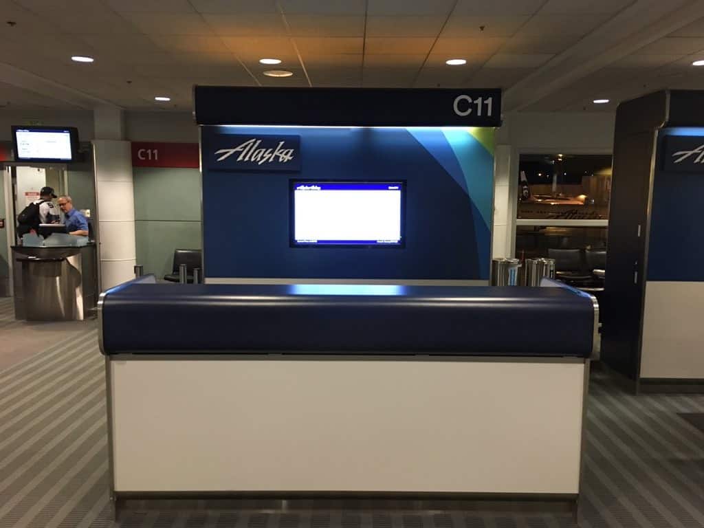
There are murmurs over at FlyerTalk about an upcoming Alaska Brand Refresh presentation coming up on January 26. I wasn’t one of the lucky to get invited to the event, however, I did spot this updated design on two of Alaska’s gate desks at Seatac last week.
About a year ago Alaska introduced new livery on some of their airplanes. To be honest, it wasn’t a huge change.
A modern twist on our classic look. #AvGeek #AlaskaAirlines pic.twitter.com/epGnZ0mY1j
— Alaska Airlines (@AlaskaAir) February 20, 2015
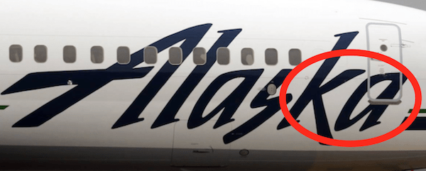
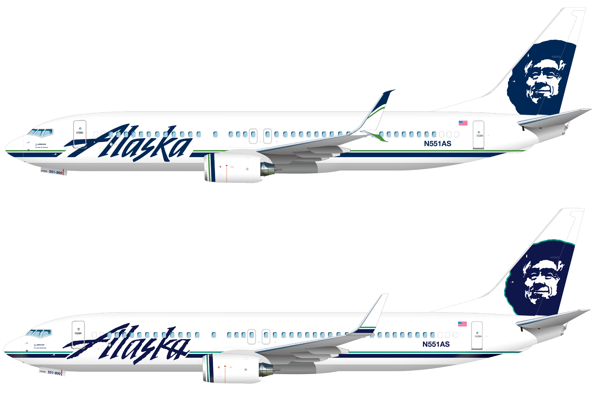
Interestingly the new livery has the “k” and “a” completely separate; while the photo above of the desk (January 2016) has the old font where the “k” and the “a” cross.

For your comparison, here is the new livery introduced in early 2015 (top) and old livery (bottom).

It will be interesting to see what else is planned for the Alaska brand refresh. Based on the livery change from almost a year ago; I am guessing it won’t be anything too dramatic. If the gate desk is any indication; it could be more emphasis on the dark blue color. This may signal a movement away from the white background they have used in the past for logos and signage.
